Posted on October 4, 2024
The Power of Color in Brand Identity: How to Make Your Brand Stand Out
The reality is, in today's saturated market you need a strong brand identity so that people will remember who you are. Color is one of the most powerful and overlooked elements in brand identity. In branding, color is of utmost importance because it can determine how a consumer will consider your brand and if they would buy from you. Let us understand color psychology and the way you can leverage it to form a stronger and impactful brand identity.
Why Color Matters in Brand Identity
Color is more than just decoration; it's all emotion. According to studies, color can account for 60%-90% of snap judgments made about products. Each color has an emotional reaction associated with it, which is why they are so important when trying to build a strong brand identity. It is critical to view the color as a message and how you choose it, will give where should be accordingly.
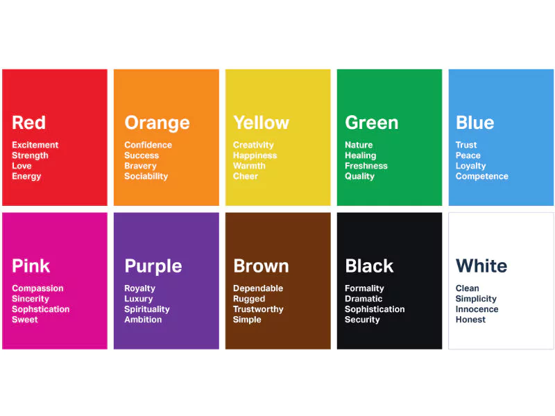
The Psychology Behind Popular Brand Colors
- Red: Bold, passionate, and attention-grabbing. Red is often used in industries like food, entertainment, and sports to evoke excitement and energy.
- Blue: Calm, trustworthy, and dependable. Many tech and financial companies use blue to build trust and convey professionalism.
- Yellow: Optimistic, cheerful, and youthful. Brands aiming for a fun and approachable image often use yellow to attract younger audiences.
- Green: Natural, eco-friendly, and fresh. Green is a go-to for brands that want to emphasize sustainability or promote a healthy lifestyle.
- Black: Sophisticated, luxurious, and powerful. High-end brands often use black to convey exclusivity and premium quality.
How to Choose the Right Color Palette for Your Brand
Also, during the development of brand identity, other colors should be considered in terms of aligning with your core values. If you are starting some kind of tech company-for example-trying to earn people's trust, maybe blue is your color. If your focus is on promoting some kind of eco-friendly product, green is more aligned to your brand message.
It's also important to note that color perception can vary across cultures. White symbolizes purity in Western cultures, while for some Asian cultures, it is a color of mourning. Therefore, targeting an international market means studying cultural color associations so that your brand identity resonates across the globe.
Color Consistency Across Branding Materials
This being said, once you've selected your colors, consistency is key through and through with all branding materials: your website, social media, packaging, even email templates. Not only does consistent use of color strengthen one's brand identity, but it increases brand recognition, too. Studies show that using a signature color raises brand awareness by 80%..
A great tool for ensuring color consistency is hex2colorpicker.com, where you can convert color codes (HEX, RGB, HSL) and fine-tune the exact shades needed for your branding elements. This tool can help ensure your brand’s colors remain cohesive across all platforms, enhancing your brand identity and recognition.
Famous Brands and Their Color Choices
Think of brands like Coca-Cola, Nike, or Tiffany & Co.-each is instantly recognizable, and a lot of that recognizability comes from consistent color. The bold red of Coca-Cola communicates energy and excitement in their brand, while Tiffany & Co.'s blue box has become synonymous with exclusivity and luxury. They've managed to master using color in communicating their brand identities.

Conclusion
Color is a powerful tool in building a strong and memorable brand identity. By understanding the psychology of color and using tools like hex2colorpicker.com, you can create a color palette that not only reflects your brand’s values but also resonates with your audience. Whether you’re starting from scratch or rebranding, the right colors can elevate your brand and help it stand out in a crowded market.
